branding+marketing

hi, let's storytell together

Riverwind

Riverwind is a senior care facility located in Michigan. They offer everything from nutritional meals to full laboratory and diagnostic services. They wanted their new site to really embody the nature aspect of the care facility, since it was located on a beautiful, earthy campus. They wanted it to look peaceful and give people an “at home” feeling. The previous site featured a lot of blue, which didn’t tie into their logo or the earthy feel they were looking for, so we removed that and opted for a much earthier palette.

Services

Successes

Color Palette & Fonts

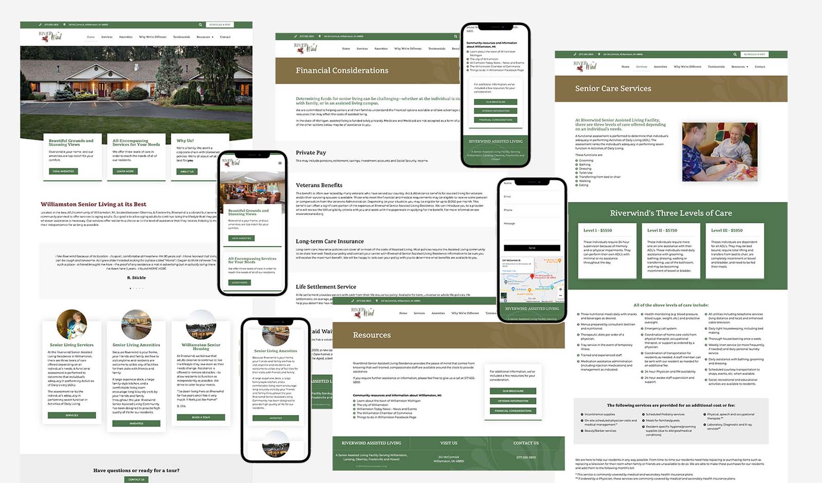
One of my favorite things to do is create new color palettes. The old site featured a lot of blue, black, and green. I removed the blue and black and opted for a forest green, light grey, light green, and brown. The old site also featured only sans serifs, so I pulled a serif similar to the one they had in their logo to use as the headers. I did this to add a more traditional and professional feel since it is a care facility, but I felt the font choice really complemented the new natural colors as well.

looking for more?

Aren’t we all? Take all the time you need, or contact me if there’s something in particular you’d like to see!

ready to roll?

No time to waste! Get in touch with me to schedule a consultation, and we’ll work together to find solutions.